Rebranding: when to change your brand (and when it's money down the drain)
Rebranding means changing your brand's identity: the name, the logo, the colours, the tone of voice. Sometimes one part. Sometimes all of it.
That's the what. The hard part is the when. Because a rebrand at the wrong moment is a very expensive way of fixing nothing.
Here's when to rebrand, when not to, why it all starts with strategy, two real examples and what we charge: from €3,600 (plus VAT).
What rebranding is
A rebrand changes how people see you. Not just the logo: also what you say, how you say it and who you say it to. It starts with strategy and ends everywhere your brand shows up: the website, the stationery, social media, the sign on the door.
It can be partial or total. Partial: you change the logo, the colours or the tone and keep the name. Total: the name changes too, as with Fons Badal, further down.
Rebrand or refresh: the difference
A refresh is evolution: it polishes the logo you already have, brings it up to date and keeps it just as recognisable. A rebrand asks whether that logo, and what it says, still make sense.
A refresh doesn't touch your positioning: it changes how you look, not where you stand. A rebrand almost always changes it.
If your brand says the right thing but looks dated, a refresh will do. If it says what you no longer are, you need a rebrand.
When to rebrand
Your business has changed and your brand hasn't. You sell something else, to other people or at another price, and the brand still tells the story of ten years ago.
Nobody can pronounce your name. Or remember it. Or they mix it up with a competitor's.
You're embarrassed to hand out your business card. If you don't show it off proudly, your customers won't talk it up either.
Your brand promises the opposite of what you sell. A clinic that wants to feel calm, with a molar in its logo, for instance. Yes, we have a case. It's further down.
A merger, a new partner or a change of owner. What was there no longer represents who's there now.
When not to rebrand
When you're the one who's tired of the logo. You see it a hundred times a day. Your customers, once a month. It doesn't bore them: it rings a bell. And recognition takes years to build.
When the problem isn't the brand. If the product fails, the service is slow or the price doesn't add up, a new logo won't fix it. It just paints over it.
When it's about leaving a mark. A new director who wants to christen the job with a logo. It happens more than you'd think.
When there's no budget to roll it out. A new brand on an old website, with the old stationery and half-updated social media, is worse than changing nothing. If you change, change everything, even if it's in stages.
When you're following a trend. The logo that's in fashion today is the one that'll look dated tomorrow.
What to keep: your brand assets
Before you change anything, take stock of your brand assets: what people recognise without reading your name. A colour, a symbol, a shape, a line.
That's worth money. Throwing it away is easy; getting people to recognise you again takes years. Spanish supermarket chain Caprabo has just brought back its Pac-Man-style symbol in its new logo.
A good rebrand starts by deciding what stays. Sometimes, nothing: at Fons Badal there was nothing worth saving.
Rebrand strategy: reposition first
A rebrand without strategy is a change of clothes. What really changes a brand is repositioning: the place you want to hold in your customers' minds, against whom, and why they'll choose you.
That's why strategy comes before the logo. It answers four questions: who you're talking to, what makes you different, what you promise and with what personality you say it. With that in writing, design stops being a matter of taste.
A quick test: write one sentence on where your brand stands today and another on where you want it to be. If they say the same thing, you don't need to reposition: a refresh may be enough. If they're different, that gap is the rebrand.
The two examples coming up are exactly that: two repositionings. The logo was the last thing to change.
Rebrand example: Fons Badal

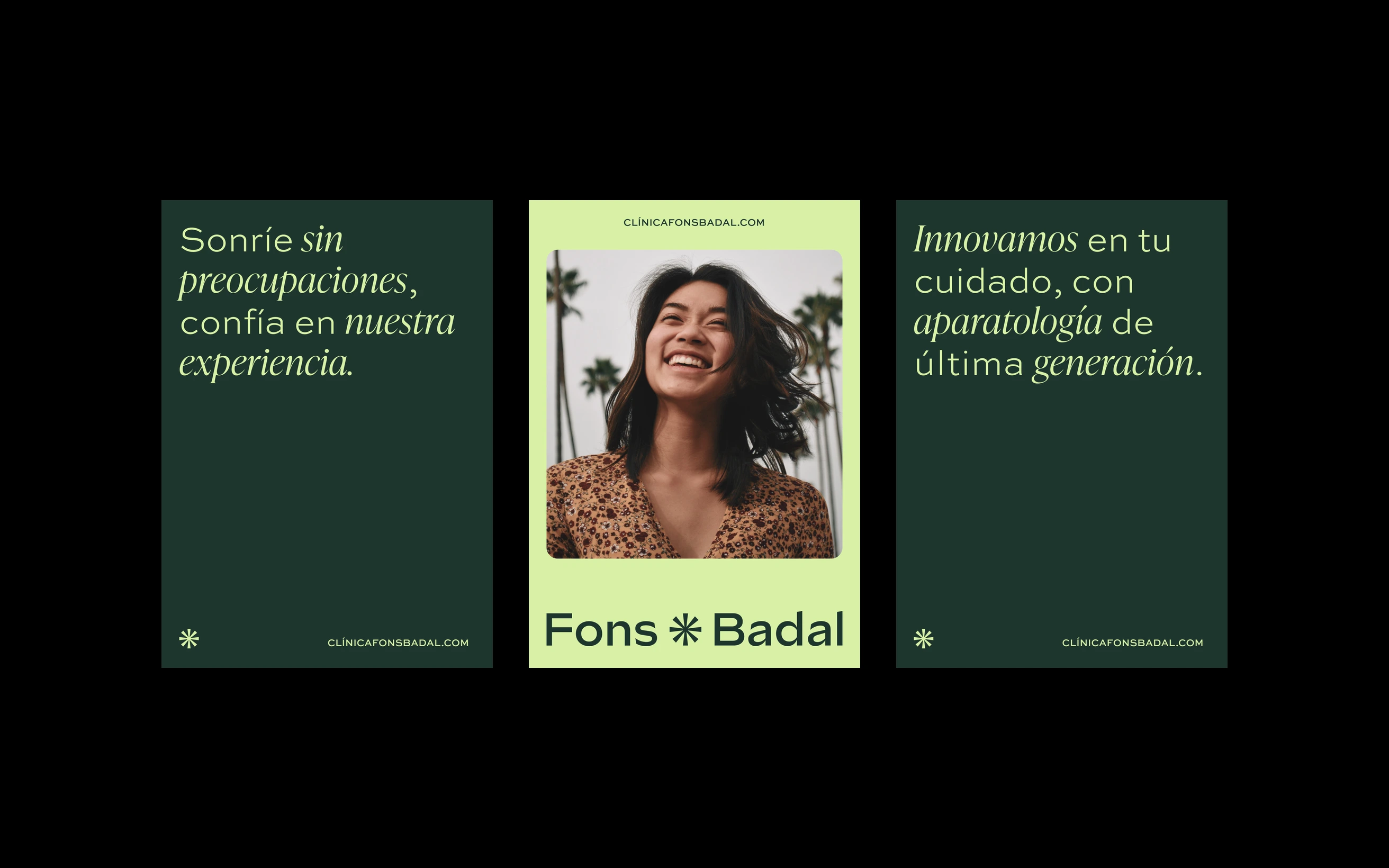
Fons Badal is a dental and aesthetic clinic with over forty years behind it.
Before: a name made from the initials of some ancestors, which nobody could pronounce. A molar in the logo. An image stuck in another era. And a hacked website.
This one did need a rebrand. The clinic was run by two doctors who wanted a visit to the dentist to feel like care. And the brand was still talking about teeth.
First, the strategy: reposition the clinic from treatment to care. Stop competing on technology, where every clinic says the same thing, and compete on how you feel in the chair.
Everything else came from that. The name: the clinic took theirs, Fons and Badal, joined by an asterisk. Then, three noes. No teeth in the logo. No dental-clinic blue. No selling state-of-the-art equipment. Nobody likes going to the dentist, so we sold care.
Strategy, identity, photography art direction and a new website that we look after. The full case is here.
Carla Fons, dentist and CEO at the clinic, puts it like this: “We had a name nobody could pronounce and a hacked website. Today the clinic carries our names, and patients arrive knowing how we'll treat them.”
Another rebrand example: RTTH
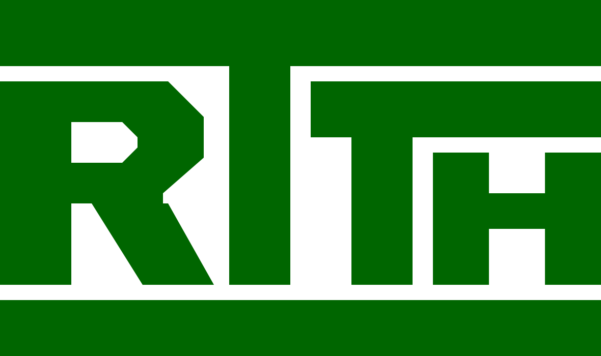

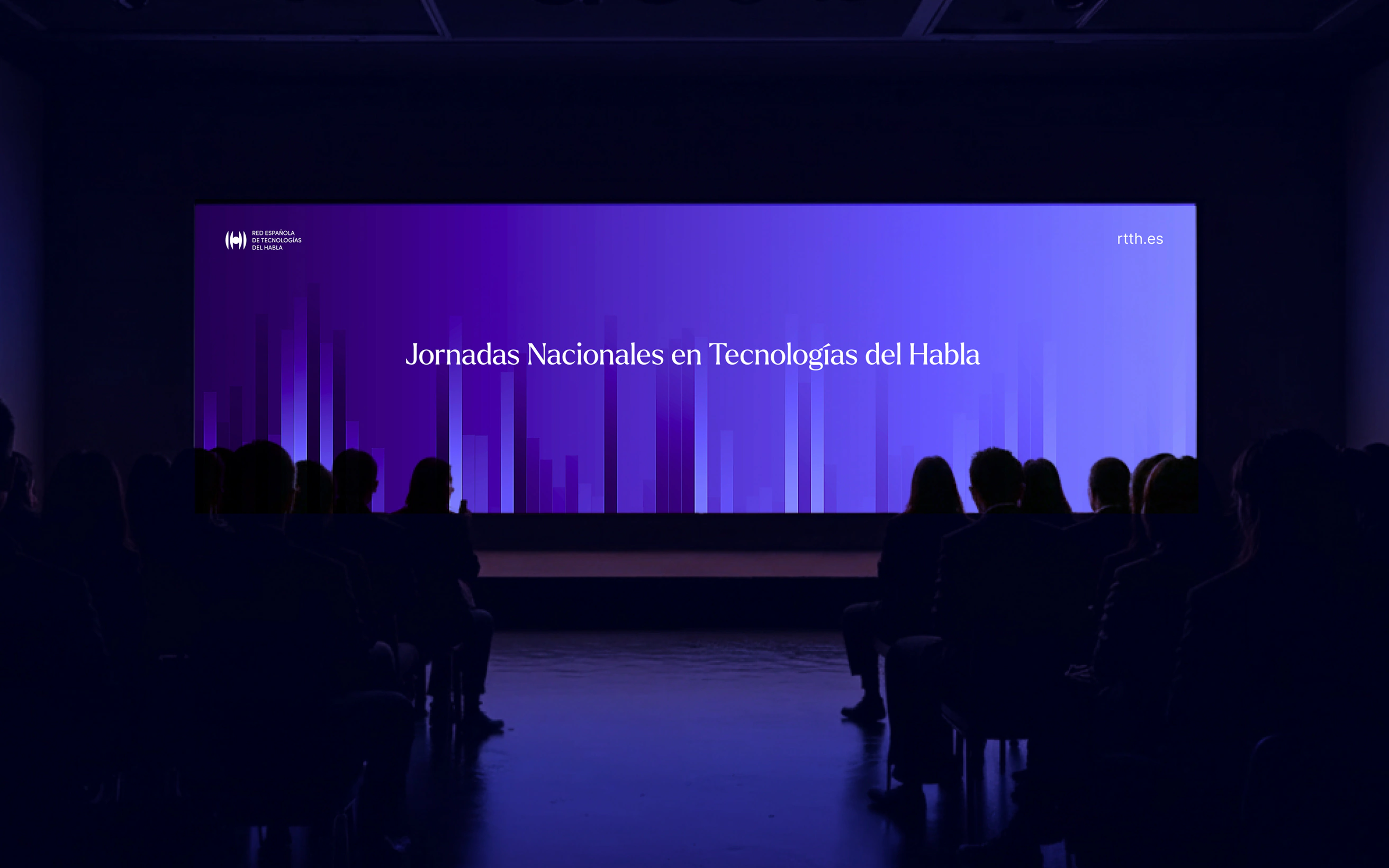
RTTH is the Spanish Thematic Network on Speech Technologies: researchers, universities and companies working so that machines understand and speak Spanish, Portuguese and Spain's co-official languages.
They'd had the same image since 2000. Cold, academic, and only understood by their own. And they wanted to reach companies, institutions and the general public. Another of the signs above: the brand said what they no longer wanted to be. The challenge was to reposition them: from an academic network talking to itself to the go-to name in speech technology for the people who use it.
The hard part wasn't the design. It was a committee of more than ten people, all of them with a say. That's why strategy comes first: they interviewed six audiences, we analysed the answers and an idea came out of it, from knowledge to impact. With that on the table, the debate was no longer which logo people liked best, but which one told that idea best.
Then a website that explains the science without dumbing it down. The full case is here. And for another branding case, there's an alarm company that sells calm, not fear.
What a rebrand includes
Ours, in order. First, a diagnosis: what works in your brand and what doesn't, internally and against the competition. Then the strategy: who you're talking to, what makes you different and what personality you have.
Next, what people see and read: logo and variations, colours, typefaces, art direction, tone of voice, tagline and manifesto.
And finally, the brand guidelines and application examples, so the brand is used the same way everywhere. Without them, six months later everyone's using it their own way.
What a rebrand costs
A rebrand with us costs from €3,600 (plus VAT): diagnosis, strategy, identity and guidelines, what our branding service includes. And a custom website with the new brand at €4,200. The price is fixed, in writing, before we start.
Why not €300? Because a €300 logo is a drawing. A rebrand is deciding what your brand says before anything gets drawn. The strategy is the expensive part, and it's what makes the logo work.
| What | Price |
|---|---|
| Branding: diagnosis, strategy, identity and guidelines | From €3,600 |
| Custom website with the new brand | From €4,200 |
| One-off changes | €50/hour |
Before you ask for a quote
Ask yourself three questions. What problem does the change fix? Do your customers notice it, or just you? Do you have the budget to take it everywhere, not just to the logo?
If you're clear on the first and said yes to the other two, let's talk. If not, keep your money. That's us telling you, and we make a living from this.