Fons Badal is a true beacon of innovation and progress in the world of dental health and aesthetics, with a rich history spanning over four decades.
Today, it is led by two extraordinary doctors: Dr. Fons and Dr. Badal, who are both at the forefront of their field in both medical and academic spheres.

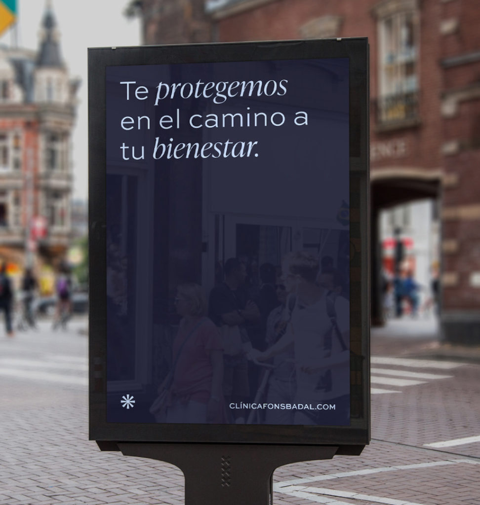
In the face of the challenge of providing differentiation in a saturated and essential market, we decided to create a strategy that went beyond the common standards of dental clinics. To achieve this, we developed a narrative that connected with different audiences, demonstrating the quality, honesty, and innovation of the services offered at the clinic.
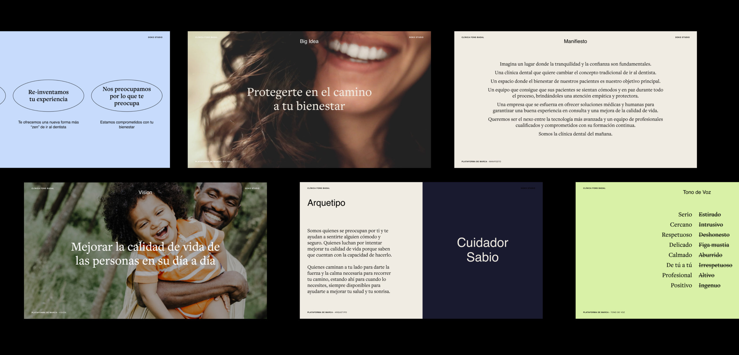
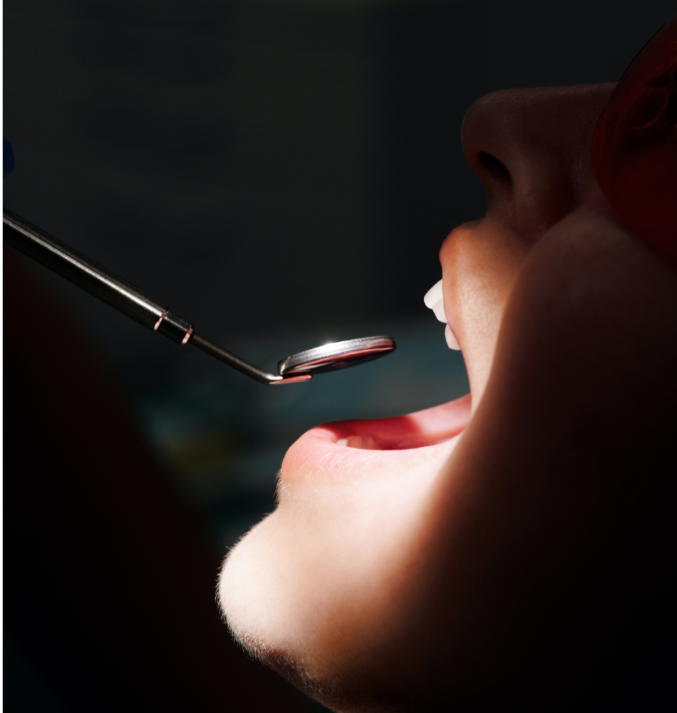
Thanks to the analysis of the audiences and motivations, we came to the conclusion of a clear insight: "Visiting the dentist is not a pleasant experience."
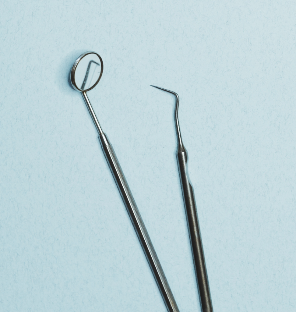
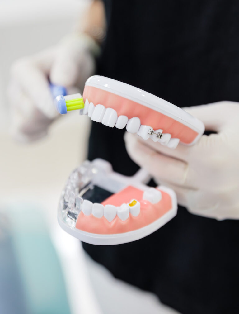
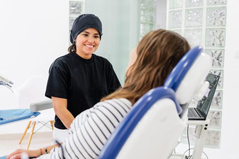
We helped Dr. Fons and Dr. Badal develop their story through a positioning territory that redefines the traditional concept of going to the dentist, where patients are accompanied throughout the entire process with medical and human solutions, providing a more comfortable experience. All of this is achieved through continuous training and the use of state-of-the-art equipment.
And with a clear purpose: "To improve the quality of life of people in their day-to-day lives."


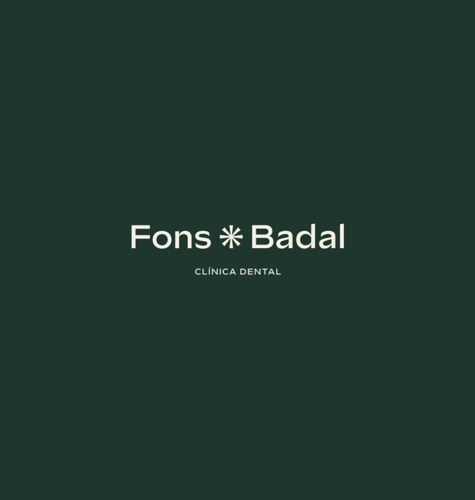

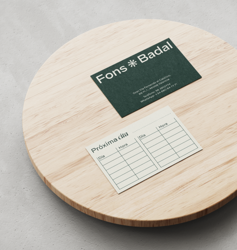
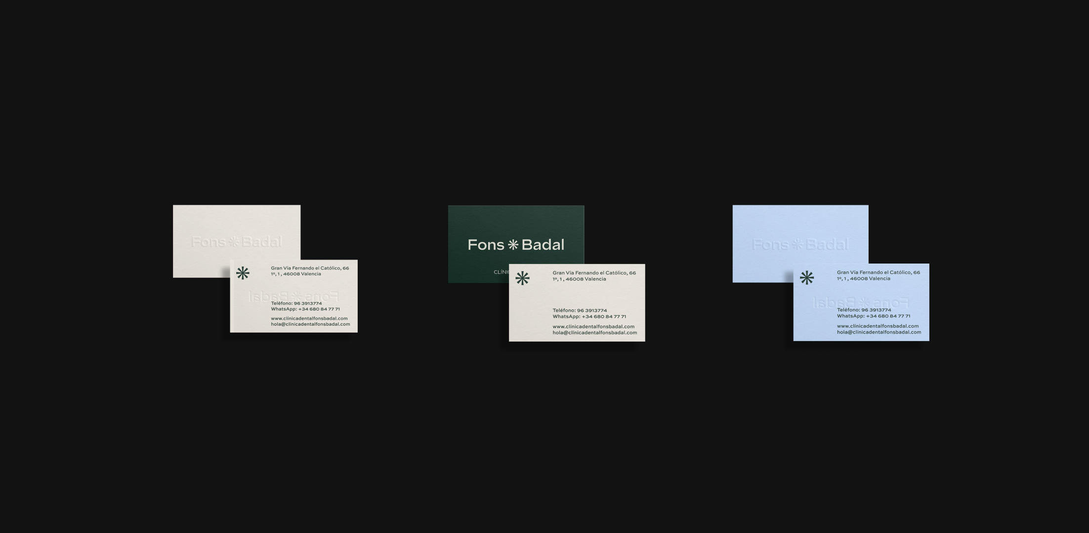
The visual identity of Fons * Badal arises from the concept of 'Innovating in your care' and the union of two doctors with a long trajectory behind them.
The symbol reflects the union of two professionals, but also alludes to innovation where the "asterisk" symbolizes the ability to combine and adapt ideas to create innovative solutions that can improve people's quality of life. A flexible logo has been created that adapts to all points of contact with the public and is durable over time.
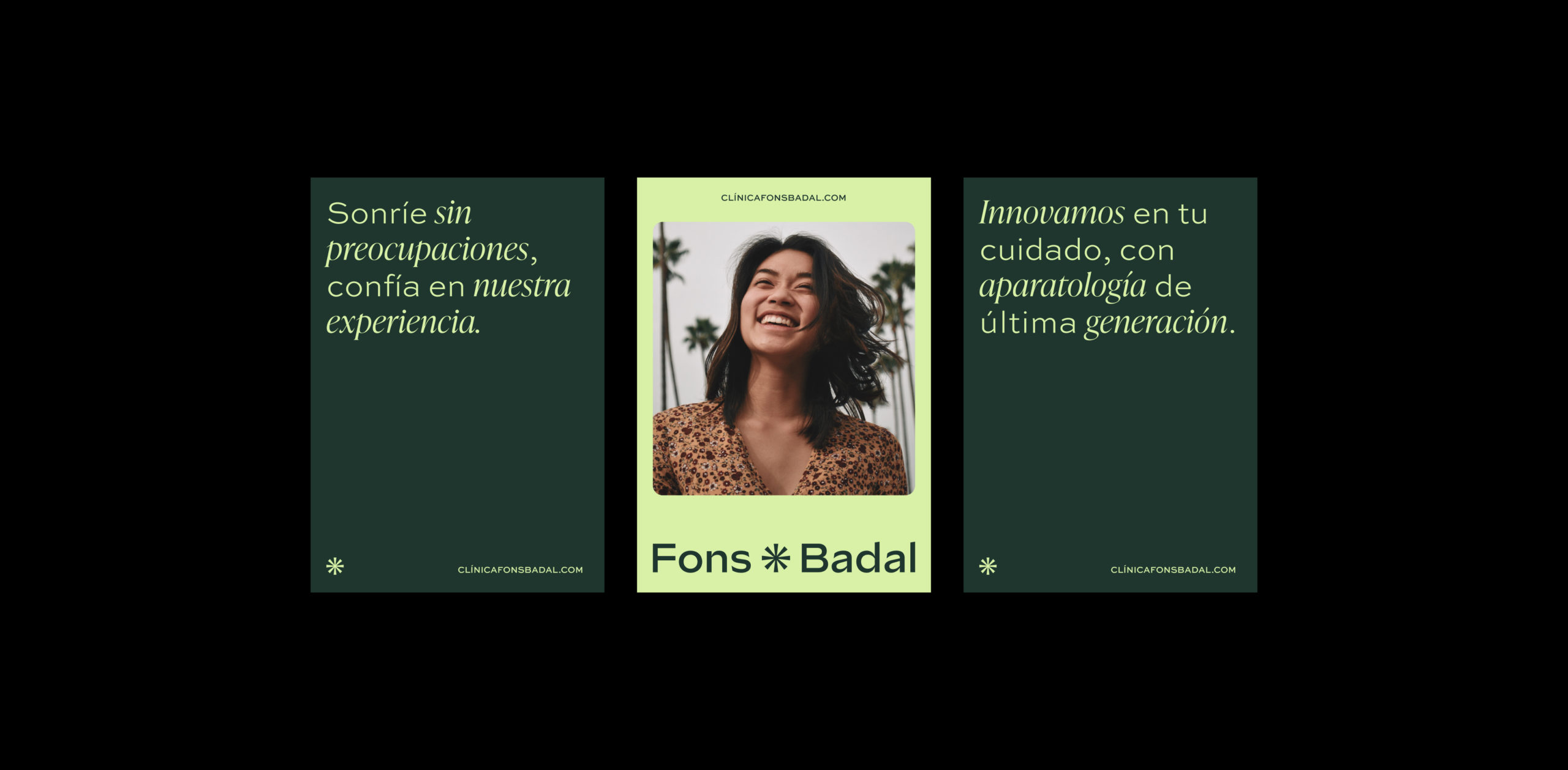
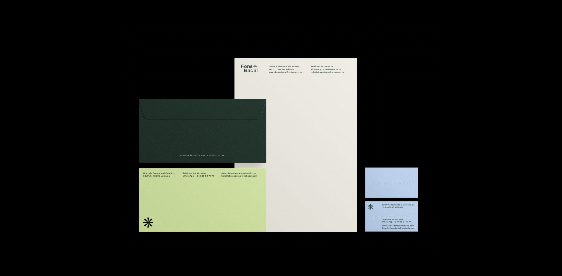
The visual system is based on typographic compositions and photographs that reflect everyday life with an honest and transparent approach. The color palette is composed of a primary and secondary set. The primary set alludes to calmness, freshness, and positive energy, while the secondary set is more linked to innovation with more vibrant colors that are more present in digital media.

Primary Pallete
Calm - Freshness - Positive vibes


Secondary Pallete
Innovation