Pura Trufa packaging
The whole countryside in a jar
Gourmet food
Project information
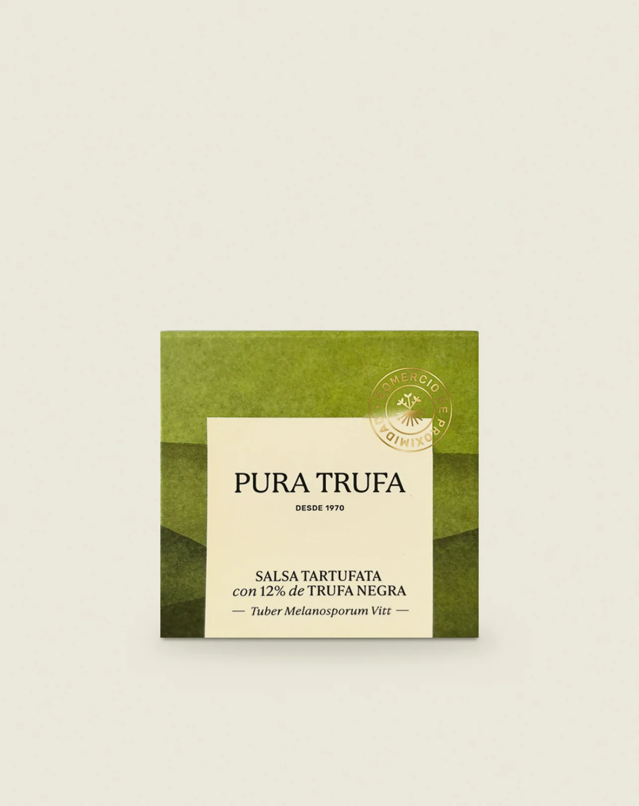
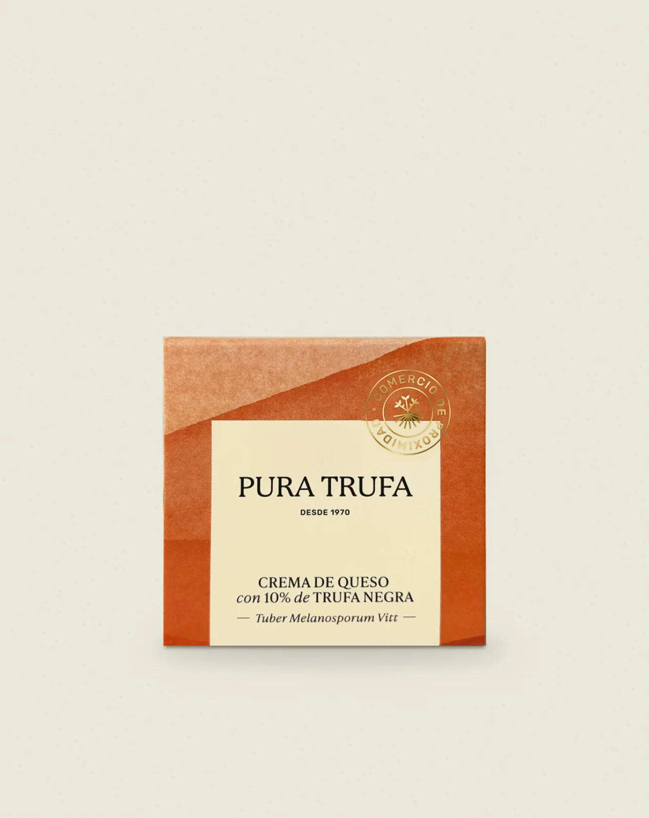
First came three preserves: tartufata sauce, cheese spread and truffle slices. Then three truffle jams: Esperiega apple, porcini and onion. Then the extra virgin olive oil. And finally, a Celtic pig pâté.
Eight products in four batches. With one obvious risk: each batch looking like a different brand.
And every pack had three jobs at once: stand out on a deli shelf, sell from a photo on the website and look good as a gift.
The easy way out in this sector is black, gold and a photo of a truffle. Textbook luxury. Exactly what the brand had left behind: Pura Trufa doesn't sell luxury, it sells a family's truffles to share at the table.
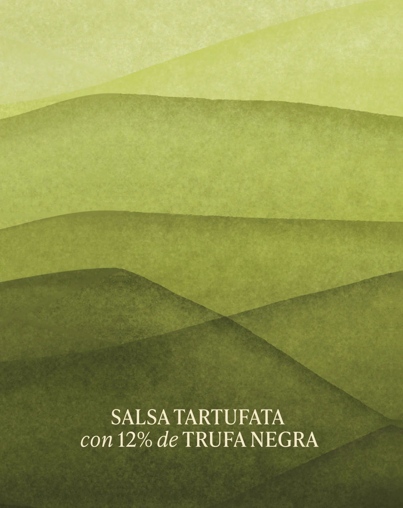
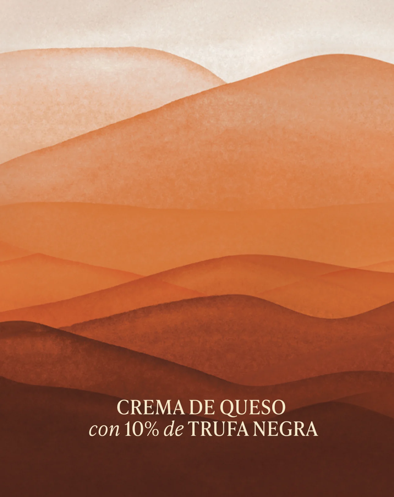
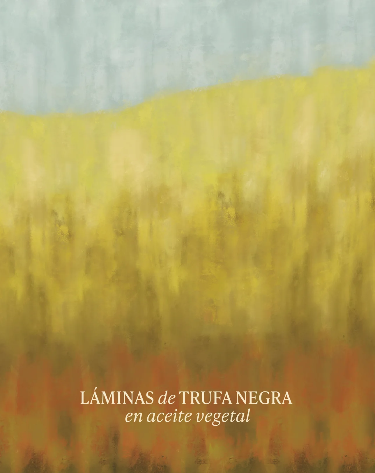
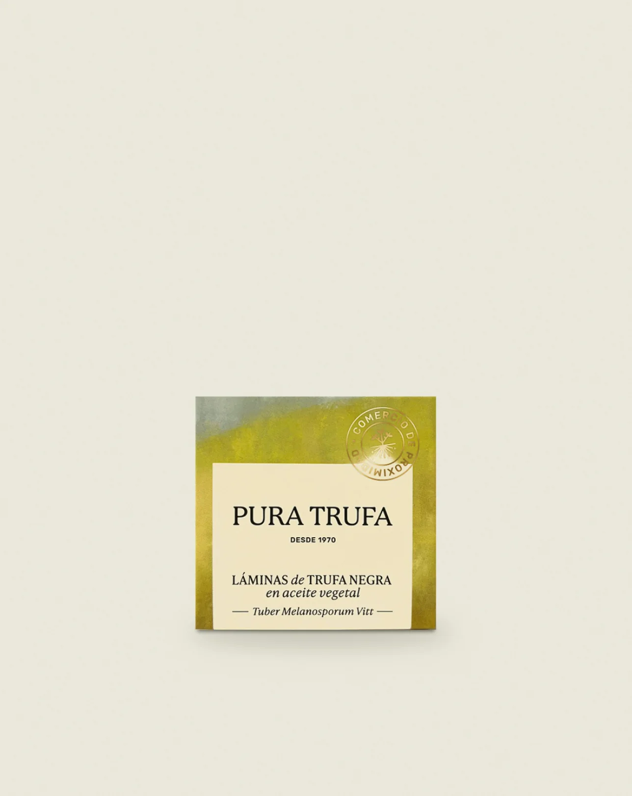
So we didn't make eight labels. We made a system: a shared base with the brand and, for each flavour, a different illustrated landscape inspired by the countryside around Sarrión and Mora de Rubielos. The colour changes. The family is unmistakable.
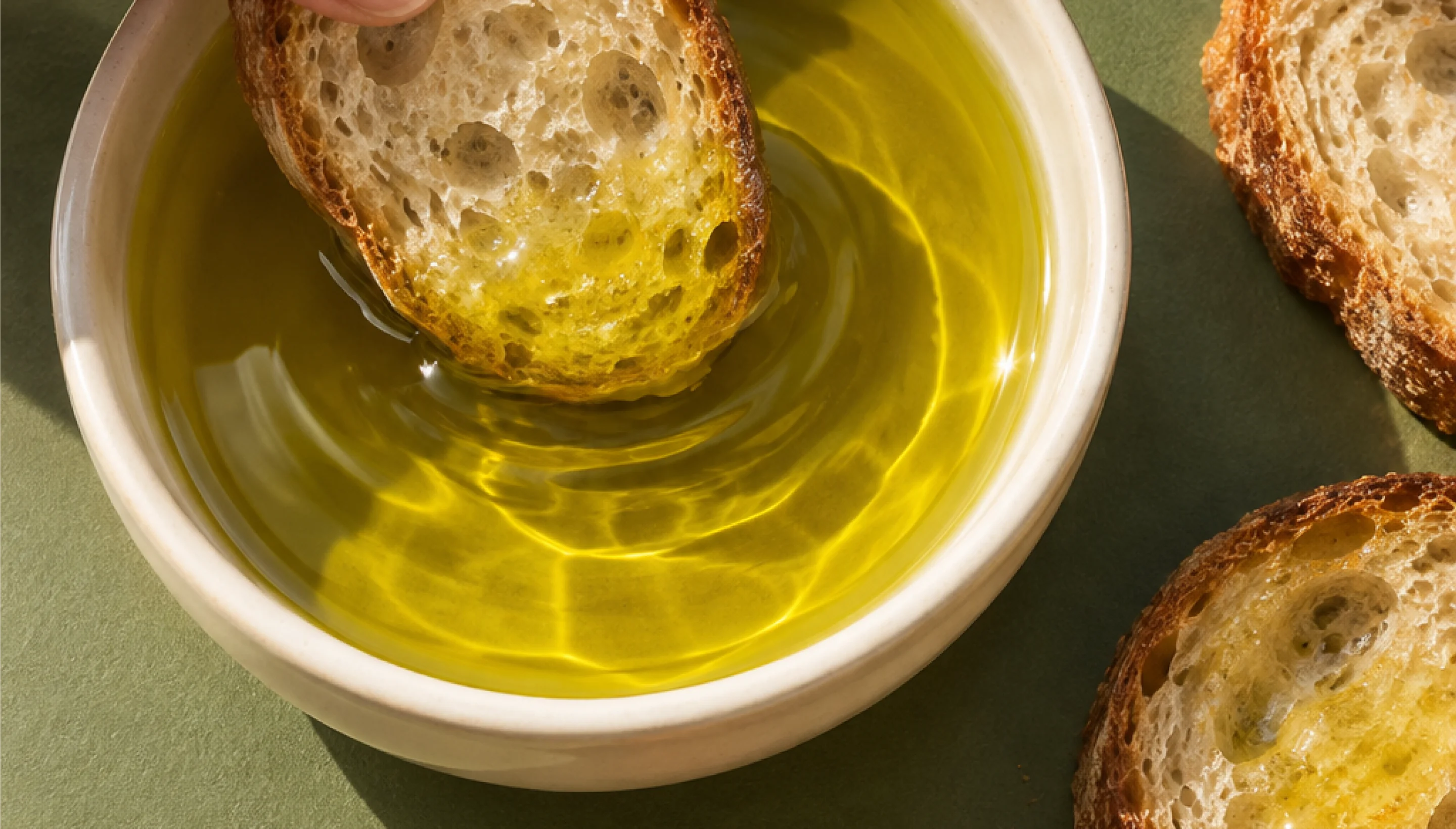
The oil is the star product. That's why it gets a design of its own: a tin among olive branches.
Today they sell in their own shop, online, in delis all over Spain and in local grocers and souvenir shops.
And the range keeps growing. Every new product goes in the same way: one flavour, one landscape.
- Services
Packaging
Illustration
Photography art direction
- Website
Project summary
Eight products, and none of them looks like the shelf next to it. Each flavour carries its own Teruel landscape, and every one is Pura Trufa before you read the label.
“I don't know much about design. Truffles, I do. And when I see our jars in a shop at the other end of Spain, I recognise the land we dug them out of.”
Next project
Nutriestética
The medicine of wellbeing